Saturday, March 24, 2018

Table of Contents Outline

In the image below, I have drawn some of the examples that I had researched to brainstorm on what mine could be like. 

The center drawing of the photo is what my Table of Contents will most likely look like. 
Since I like the idea of showing more pictures on the left page but not too much, I decided on locating some informational quote, title, or saying in the center. And on the right page, there will be one image in the center, with the rest of the content info surrounding it. So as you can see, the pages will have a cool contrasting layout. 


I will also incorporate page numbers for the images and separate categories for the content information like, "Features," "Interviews," "Tutorials," and "In Every Issue."

Thursday, March 22, 2018

Cover Outline


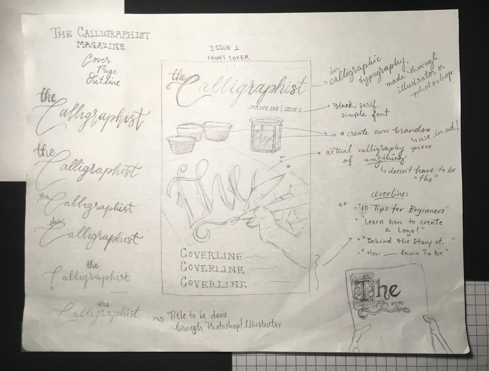
I wanted to dedicate this post to explaining and outlining the cover of my magazine.

As shown in the center of the photo below, I have drawn what is a rough draft of the cover, including the masthead/title, dateline (issue & season), main image, and where the coverlines may be located. And I am yet to create an official selling line.

Since most of what is written in the photo cannot be read clearly, I will rewrite the information in this post, below the photo. 


Masthead: The title, The Calligraphist, will be made through photoshop, illustator, or through a font found in typekit and hopefully I can create a hand-written-like effect. Otherwise, I will just make it a fancy, 3D cursive font.

Image result for calligraphy  effects
Image result for calligraphy typography effects

Image result for calligraphy  effects


Dateline: Because the overall topic of my magazine is quite specific, I do not plan on having weekly nor monthly issues, but issues according to the seasons: summer, fall, winter, and spring. So the dateline will consist of the "Season" and "Issue." I want them to be simple, serif font that contrasts with background.

Components in main image: For the calligraphy ink in the background, I will create a new brand to stick on the little jars and use it for the advertisement as well. The word(s) on the paper won't specifically be "the," as this was just a rough draft, so I can write anything, which can then tie into an original content article.

Coverlines: As for the coverlines, none are specifically determined yet, but they may be along the lines of "10 Tips for Beginners," "Wedding Preparation Ideas," "Learn How To Create a Logo!," "Behind the Story of....," etc.


Citations:
“Inkwell: Ink Effect for Photoshop.” Go Media™ Arsenal, arsenal.gomedia.us/shop/effects-layer-styles/inkwell-ink-effect-for-photoshop/.
“Gold Leaf Effects.” Tshirt-Factory Blog, 13 Nov. 2014, blog.tshirt-factory.com/gold-leaf-effects.html.
Lenker, Jason. “Watercolor Text Effects.” Pinterest, 8 July 2015, www.pinterest.com/pin/262475484510160914/.
“Calligraphy Animated Handwriting.” Calligraphy Animated Handwriting - After Effects Templates, motionarray.com/after-effects-templates/calligraphy-animated-handwriting-58209.

Sunday, March 18, 2018

Group Meetups

So this week, I met with other classmates to go over our projects so far and when we got to mine, I was kind of surprised to know that no one really knew what calligraphy was. And knowing this, it makes me more motivated, though slightly hurt, to make this a better,  informative, and meaningful magazine, even through only a few pages.

Some things they touched on were:
  • title change--> "Calligraphy and Me"
  • reccuring wedding articles
  • articles on special events
  • clothing that includes text
  • do-it-yourself activities
  • daily life activities that include writing
After they mentioned changing the title to "Calligraphy and Me," I thought about it: it would make the magazine more personal and directed to a "me," rather than focusing of the target audience/readers, and content would be implied to focus most on work made by "me" rather than by the journeys and processes of others. It would kind of go against my underlying purpose of the magazine, which is to appeal to the target audience and focus on their own success through reading articles and following tips suggested by the words in the magazine. Although, I will keep the suggestion in mind and if I feel like it could fit, I could change it.

The rest of the topics on weddings, events, DIY's, etc. were all things I already knew I will somehow incorporate into my magazine.

But most of what they talked about to me became confusing because they did not well understand what exactly I was trying to say I was going to include in my magazine, but all resulted well after they finally did understand. And I hope to ask others for questions or points of confusion that they would suggest I change in my ideas so far.

Artists Magazine

I am dedicating this post to writing down notes from anything interesting and important from the Artists Magazine that I bought at the bookstore. 


COVER
-title in a white background box
-main image--> artwork made of paper
-subtitle "Wild for Flowers" --> what most of issue will focus on
-clear coverlines
-colored texts in relation to cover image: purples
-bottom box section, different colored background--> more coverlines (+)

I hope to create a cover image similar to this, where there could be spacing for a title and coverlines, without overlapping the actual image. It's a clean and not too simple cover, that well suits their target audience. 


TABLE OF CONTENTS
-images of artworks with page numbers
-five categories: Compositions, Prime, Build, Outfit
-top halves of both pages--> images
-bottom halves of pages--> content/text
-artworks ranging from, paper, painting, photographs, to origami

This is not one of the best layouts for the table of contents of a magazine in my opinion, but I like how they showed the differences in artworks that is contained in the magazine. They also used nice fonts for their numbers and text.


TWO-PAGE SPREAD (with AD)
-left page--> advertisement for Royal Talens oil paints, van gogh brand
-main image of Van Gogh's 'Sunflower' painting
-right page--> original content article
-article about Claude Monet, historical & famous artist

Using a paint brand in the name of a historical artist gives users the mental thought that they can paint as well as him. Advertisement technique using a historical and well-known person. 


TWO-PAGE SPREAD
-introduces artist
-aesthetic and nicely spaced border using artist's art
-step-by-step demonstration of artist's illustration, layer by layer

Just like the other magazine I looked at, this one contains a step-by-step demostration, which since seems like a prominent idea for articles in these magazines, will be something I certainly want to include in my magazine. 

TWO-PAGE SPREAD
-continues step-by-step demonstration
-bottom image of artist working, with a quote by her
-advertisement of Staedtler pens/markers-coninues red-colored theme from previous page
Although the ad has nothing in similarity to the article, it seems like it could connect and be related because of the use of similar colors, so a reader may continue to that page and read it, thinking it is part of the article and maybe be interested in the product instead.


Citations:

Brodskaya, Y., Eckwall, J., & Procter, K. J. (2018, April). Contents. Artists Magazine35(03), 2-3